Pretty Things On Etsy

It’s been almost 3 weeks since I last posted. Time really flies. I’m so sorry about the gap in the posts – I’ve been busy with schoolwork, essays and now finals.

So it’s December and everything is becoming Christmas-ey and ever since I liked Etsy on Facebook, I’ve been getting random suggestions of products that have been featured by the Facebook page. My favourites so far (almost literally everything they’ve featured): Grizzly Bear Bean Bag!?, this amazing Zerogravity Watch, Siberian Husky Team necklace, these super awesome TOMS with the London skyline that made me wish I could draw like that and perhaps the most affordable of the lot that I happened to chance upon, an Alice In Wonderland phone dock.

Such amazing talent out there, it’s really quite stunning. A lot of the stuff is out of my budget, even if I wanted to spoil myself. Nonetheless, they’re still pretty to marvel at. In some ways, they revive my belief in creativity and imagination, which we all know fades with the busy city life sometimes.

Anyway that was just a quick run through of things I’ve had my eye on recently! Here’s where I take the chance to promote my hand lettered cards. I promise you that they look and feel amazing in real life. Also, if CAD$5 per card is too much for you, feel free to talk to me (if you know me personally) or email me at astoldbycaro@gmail.com. I have extra stock that I’m selling at a cheaper rate but there’s a catch. There’s always a catch 😉

Godspeed to everyone who’s reading this. Have a lovely weekend.

Pinstriping & Glen Weisgerber

Recently I came across this guy named Glen Weisgerber, a master pinstriper who did lettering tutorials which are amazingly mesmerising.

Before getting carried away with how awesome his talent and skill is, I have to admit that I had no idea what pinstriping was until I looked it up. Pinstriping is the application of a thin line in paint or other material decoratively and is notably and primarily used to personalise and customise automobiles.

So, Weisgerber is a master pinstriper who was recently filmed giving tips on hand lettering with paint and it is so captivating. The snappiness of his single stroke lettering is nothing short of breath taking. (I literally hold my breath each time his brush creates a stroke). He also did a demonstration of chrome lettering, which made me wish I could paint decently, and roundhand lettering. If the first two videos weren’t enough to catch your attention, surely the last one will. I watched them in that order and by the third video I was searching for more.

Weisgerber has been in this line of work since the 1970s and with his tattoos and black fedora, he is certainly presents himself a notable character. Beyond his appearance, I’m really taken by the fact that his letterforms are produced with so much ease and simultaneously, precision. In a word, his work is incredible. Perhaps it is due to my lack of exposure, but before coming across these videos, hand lettering in paint had never occurred to me (not that I think I could do a decent job of it right now).

This man can do in a single stroke what I struggle for hours to sketch in my Moleskine and it is intensely humbling. Ah, things to aspire to become.

As Told By Caro is now on Etsy!

After about ten months of contemplation and planning, it’s finally here: my online store.

funproductshot1 mightygodproductshot1

I’ve only ever sold cards once before and it was a fundraiser for a farewell gift to someone. That was about three and a half years ago. Since then, I’ve been encouraged by my friends in many ways and have grown in my exposure and understanding of visual communication and graphic design. Using social media, we stay in touch, sharing links and portfolios of other amazing art and artists around the world. I never always understand what things necessarily mean, but I get to tap into a visual culture I would have never found without my supportive peers.

One of my New Year’s resolutions for 2013 was to start selling my craft just because I enjoy creating it and love to hear feedback from those who have come across my work. It’s already October, but I’m keeping this resolution.

I’m especially thankful (it’s Thanksgiving in Canada after all) for Jethro who provided capital, and Emma who was the one who really persuaded me and pushed the whole As Told By Caro gig into realisation. Also for Jonathan and Cassie who pepper my life with bits of amazing advice and design tidbits. Finally, I’m really grateful to each person who has expressed interest in what I do because you validate a lot of my work and you are the ones who provide me with inspiration and encourage me to be better. Happy Thanksgiving everyone!(:

what I’ve been up to:

Since school started three weeks ago I haven’t really been posting things that I’ve been doing in terms of hand lettering and/or photography so today I decided I should share a few of my work so far and also clue you in to other things I have been doing.

At University of Toronto, the Arts & Science Faculty’s student population is divided into colleges such that administration and student interaction can be better and more easily facilitated. I was recently hired by my college – New College, to provide and produce artwork for their official student publication, The Window. Our first issue comes out on Friday, 4th October and features interesting articles ranging from etymology to the Argonauts game in Toronto earlier in September. They also have an advice column and Tumblr and their guru is the window washer (get it? haha).

I’ve also been working on a logo for Skule’s (UofT’s Engineering Faculty) SCORe club. They are a community of engineering students who come together to participate and organise non-profit and volunteer activities through the year. And most recently I’ve been working on a friend’s project called Project Happy Apples (PHA).  A friend of mine in medical school at the National University of Singapore asked me to hand letter some information title sheets and header titles for his presentation that is coming up. PHA is a student initiative that seeks to educate and increase awareness of palliative care and this is occurring on a close-to-nation-wide scale. I’m excited to see where the project goes and how my work will feature in it.

IMG_20130930_001633 20130926_003458

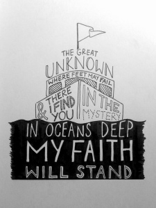
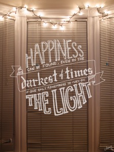
In whatever free time I have left, I doodle; the above two lyrics are my more recent works. There are nights where I really just need to relax and unwind, and I do so through these letterings. I’ve also begun to force myself out of referencing in a bid to see how comfortable I am without the constant imitation. Looking back on past work, I’ve definitely learnt to incorporate more relevant graphics and images into my lettering. What I want to master is blackletter/gothic typefaces – I still need to refer to online sources for those.

I’m glad to say that this has been the more exciting part of life in the past three weeks. My next couple of posts will probably revolve around the first The Window issue and/or the beginnings of an As Told By Caro store! October is an exciting month indeed(:

Nikon D7000!

Last week my dad gave me his Nikon D7000 because my Nikon D200 is getting old. As a result of which, I’ve spent the past two days combining photos with typography and hand lettering. The result?

lightssigned heartcookiessigned

The first quote is by Albus Dumbledore from the Harry Potter series. I recently got introduced to Hogwarts and it’s fabulous wizards and witches and I have to say I like how Rowling has empowered the individuals with very human strengths. The second, with the biscuits baked by yours truly, is a quote by one of my favourite authors, Jeanette Winterson. I’ve always been a fan of Winterson’s writing especially her semi-autobiographies ‘Oranges Are Not The Only Fruit’ and ‘Why Be Happy When You Could Be Normal?’. She has really inspired me and reinforced my belief that literature and art in general really could save a human mind from destitution.

On a lighter note, I’m so excited about what the new camera means for me – I get to take better night photography and also have increased control over my colours. This is a huge step forward for me because with my D200, I had to convert my photos primarily to black and white because the colours were so terrible. Also, I get the chance to experiment with the HD 1080p video on the D7000!

School is starting again soon if not already and I’m going to have less time to dedicate to my art in general. Nonetheless, I promise I’ll try to create something new every two to three weeks. I also have my usual list of goals that I wish to achieve during this academic year and this year’s includes learning Photoshop and improving on my Illustrator skills. More specifically, masking techniques for the former and textures for the latter.

It’s going to be exciting!

twitter & other work!

Hey everyone, just a little bit of a logistical update here, but I finally got my Twitter account started and have also set up my photography and hand lettering portfolio (albeit works in progress). My photography page also has a link to my Flickr account if you’re interested in seeing more of my photographs; the hand lettering page has a couple of my older works that I haven’t posted up here or on my Facebook site. I like looking at them when I start work on a new piece to see how I have evolved as an aspiring artist.

Do follow me on Twitter for a casual feed of information about things that interest me (and you!). Things to expect include anything that might fit the likes of a Singaporean girl living in Toronto who is thrilled by brilliant ideas, art, music, literature and cats.

I know that I’m starting out very, very small, but I really believe that passion will ease the bumpy journey ahead.

And if you’ve read everything up to this point, here’s something interesting I came across a few weeks ago that I can’t stop thinking about: an iOS app called Highs & Lows. I love the idea of stripping down your day into a best and worst moment and most especially, being able to look back at it. The colours and layout is so clean and neat too! Too bad I don’t have an iPhone.

Tanamachi Studio & Sean Wes

One of my earliest discoveries in the hand lettering world was Tanamachi Studio. Dana Tanamachi is a Brooklyn based graphic designer and letterer who runs her own design and lettering boutique. She has worked with clients like Google and TIME magazine. More recently, she worked with Puffin Books (a branch of Penguin Books) to create Puffin Chalk – a series of redesigned, hand lettered, classic children’s titles which I absolutely love. I would honestly buy them all if she did more. I love the way Tanamachi’s work flows, especially her banners and ribbons. She inspired me to break out of my usual rigid style and try something different.

Another person who has shaped the way I’ve perceived hand lettering is Sean Wes. He’s from San Antonio, Texas and runs a design firm called Bold Perspective with a partner and co-founder. Known in the design industry for his hand lettering,  Sean is a self taught inspiration. What fascinated me most about his work is the incredible amount of detail and near perfection in each of his hand lettered projects. After exposing myself to his work, I switched over to using Micron Pens instead of my regular ink pens, allowing me better control and precision in my own work.

The thing that amazes me about individuals like Tanamachi and Wes is the sheer amount of talent and passion they possess for their craft. While the design industry is often known to be competitive and cut throat, I am encouraged that it is made up of individuals who have chosen to make their art their lives. Somehow I feel better about wanting to be good at what I do not for the potential recognition or cash, but because I’ve fallen in love with the satisfaction of a job done well.

House Industries & Photo-Lettering

As an aspiring creative, I follow a couple of graphic design(ers) blogs online and read them regularly for new insight and tips. I cannot say I understand much about graphic design itself, but one thing about graphic design that really appeals to me is typography.

Recently I discovered House Industries, ‘a prolific type foundry’ that has contributed immensely to the field of design. What really stands out for me is their photo lettering app that allows you to customise and personalise your photos with original fonts from House Industries (which are all amazing!). I didn’t know this before, but Photo-Lettering Inc. (PLINC) was a type house in NYC from 1936 to 1997 that was one of the first and most successful in using photo technology in the production of commercial typography and lettering.

The process of photo-lettering required first and foremost, impeccable hand lettering and tremendous attention to detail. Typical charges went something like $18.00 for 5 words to $1,750.00 for 1000 words (in 1970’s dollar strength). So affordable for such high quality type and lettering! House Industries bought over PLINC, acquiring their glass panels, films and original lettering library. And thus began the wonderful relationship between the analog and digital forms.

Being an avid photographer and amateur hand-letterer, I really admire the efforts that went into PLINC in the 1900s. I cannot imagine the amount of dedication and passion it took the people at PLINC to carve out their quality reputation. I also really respect House Industries’ efforts to keep the integrity of the original letterings; it reflects much of their philosophy as a powerhouse of type.

Other things by them you can check out besides the Photo Lettering App is their clothing section! Completely affordable, attractive type, who could ask for more?

Heaven’s got a plan for you.

heaven

Completed this yesterday. I have used this line for a previous design but I decided to revisit it to see what changes I could make and it ended up being an exercise on self criticism and improvement. Comparing my first one from January this year to this, I have to say that I’ve become more careful with my strokes and I’m definitely more prepared to put in the effort into details. I still need to work on placement and spacing though, but I’m tempted to say that my moleskine is the small one and thus I don’t have space. Nonetheless.

Working on another one today. It’s a quote by Neil Gaiman, who is one of my all time favourite authors. He has just published a new book called The Ocean at the End of The Lane and I just ordered mine online. So stoked for that!

Anyway, have a great week everyone, I’ll be back soon.